Set of Pictogram in NYC
In class work:
Pictogram in NYC
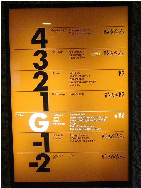
It is successful pictogram that is simple and clear to recognize what kind of services are in which floor. Designer used simple black but color change to white because of a light on the back. Size and typefaces are also appropriate.
Symbol Signs set
In Subway
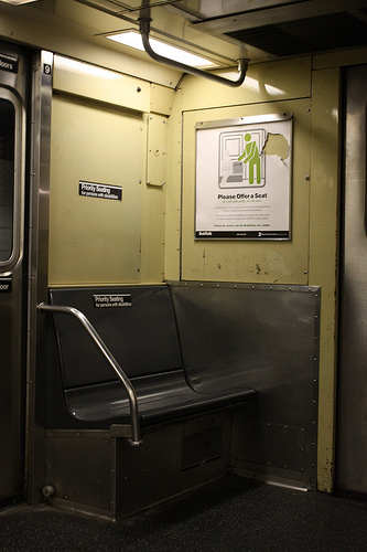
It seems recent design. Pictogram looks concise and easily understandable for reader. First example is little bit different than other two example. First example intended to read without text and it is successful. Other two examples use simple text and use of contrast colors which are red and greed to focus on these poster.
Extra example
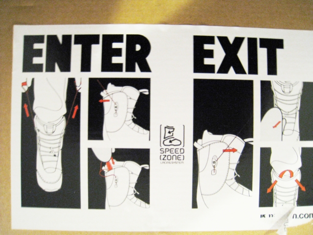
It is Burton’s snowboard boot explanation. Pictogram on the middle is easy to understand rather than just text but still it seems unsuccessful because it is little bit difficult to understand at once.


